AD | Collaborative post
As soon as you move into your own home, whether that is rented or owned, there are bound to be things you want to do. We have lived in our house for 7 years now and our list of things to do is still a mile long. I actually think you need a few years in your home before you make any big decisions so that you can get used to things like where the light sits in a room, how a room works for you and if you need to change the purpose of a room.
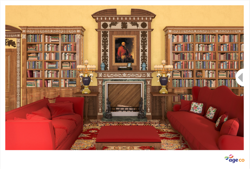
Personally, I look everywhere for inspiration when it comes to ideas for my home. It could be from magazines, other peoples homes and for something a bit more fun you could look to film and TV. Age Co have used the library from Downton Abbey as inspiration to come up with redesigns for celebrities!
I wanted to share some of my favourite interior styles and how I might be able to incorporate some ideas from the redesigns in my own home.
The Downton Abbey library
We have a 1900 Victorian semi and I like to try to keep some of the period features where possible. For instance, I have started to add the fancy ceiling roses back into some of the rooms and will continue to do so for each room that we renovate.
We’re a house of big readers and something I love about the Downton Abbey library is all of the books. How could I not?! Our living room is 24ft as it is open plan with our dining room and also has alcoves next to the chimney breasts. I would love to have some beautiful shelves built in to these alcoves so that they all match and they would be home to some of our favourite books.

Mary Berry’s redesign
Having such a large living room means that I don’t really know what to do with the walls because there’s so much space to cover. I love colour and don’t want the room to be really plain. Mary Berry’s redesign features a stunning feature fireplace (although not functioning) and I absolutely love the colour of it. This has then been used further in the room with soft furnishings and the walls still have a nice, soft pattern on them.

Joe Wicks’ redesign
Due to the size of our room it is easy for it to look messy a lot of the time. Joe Wicks has had a Scandi-style redesign of the library from Downton Abbey. Although the wall colour is a bit too plain for me I love the pops of colour, especially with the leafy green plants. This is something I’ve been trying to add into our living room recently so it’s nice to see how others have done it. I also love how practical the shelves are, only being a height where people can reach them rather being all of the way to the ceiling.

Obviously, both of these redesigns are very different to the library in Downtown Abbey but it’s so fun to see how someone else might see a room. Age Co have also done redesigns for Graham Norton, Ruth Langsford and Gloria Hunniford and you can see them here if you want to find out more.

